Typography Treatment
For a few years, Elena has been functioning as an all-purpose communications typeface for maetl.net and various creative technology projects—PDF documents, slide decks, work-in-progress essays, data visualisation experiments. It has been my favourite typeface of all time to use and I’m sure I will do many awesome things with it again, but I want to look to the future and different visual approaches.
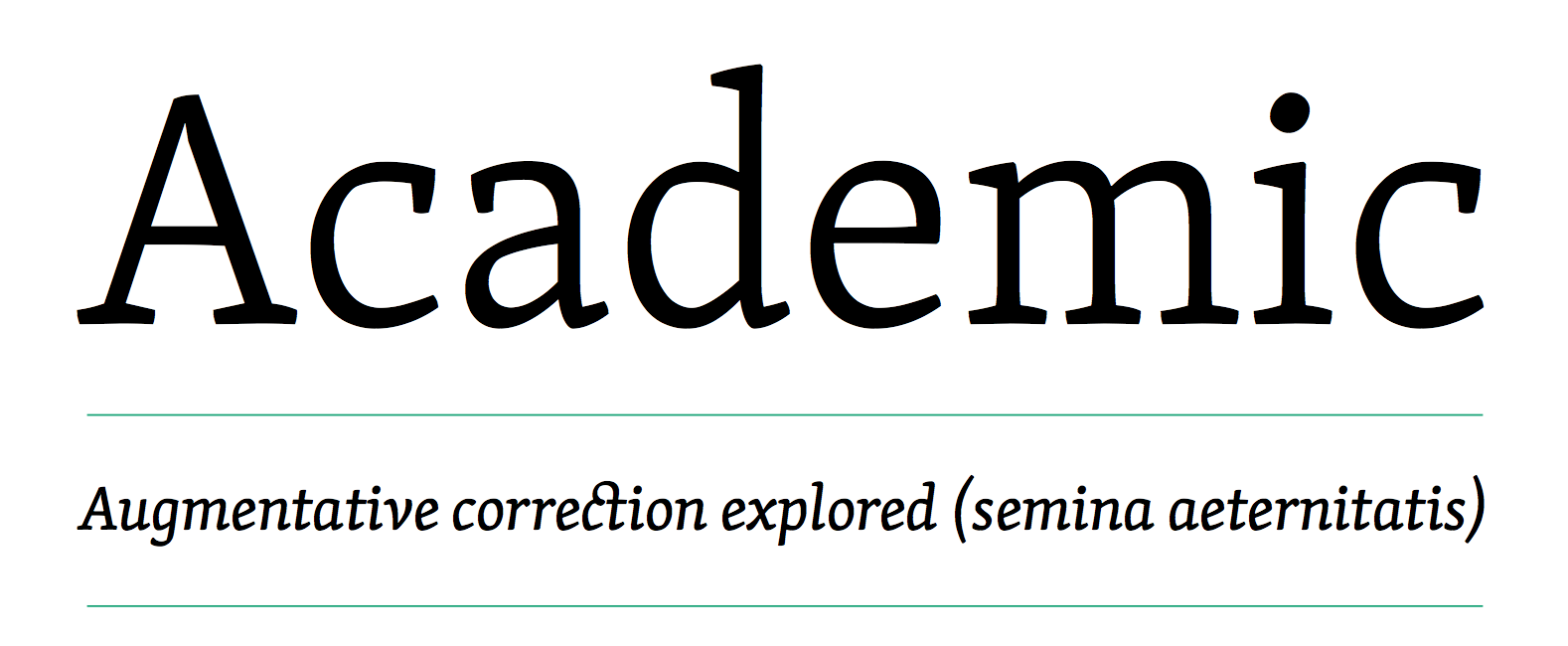
2000s and early 2010s low contrast serif influence
I could easily go forward with Elena, as it still has so much potential but I want to take a risk and do something new here. Both to help motivate me to publish new writing and to support a more visual and interactive media-oriented direction reflecting on my creative practice.
I don’t want to spend too much time or get too hung up on this as it could end up becoming a decision angst attractor and obsessive rabbit hole (side note: this is why I am in awe of what type designers do—the way they unify so many subtle design decisions into a cohesive whole, choosing precisely where to follow expectations and where to break them).
To carry the next editorial direction for the site, I think what I’m looking for is a contemporary brutalist serif imbued with a sharp contrast between contemporary aesthetics—exposed corner vertices, strong triangular serifs—and a more stable classical texture in body text settings.
Trying to define brutalism could get messy. In this context for me, it’s mostly about showing the seams of construction, being honest to the raw material in the final form. Raw material in this case being the Latin alphabet represented digitally via Bézier curves and vector splines. There good arguments about virtuality and the absence of materiality in digital fonts, but from a programming and computer science perspective we can acknowledge the dualistic nature of Bézier curves being both idealised forms with no physical existence and also mapping to a direct physical representation that actually runs on the computer).
With all that in mind, I also want to compare and contrast these ideas for a contemporary serif typeface with alternative type treatments in the Akzidenz and geometric sans design space as a kind of null hypothesis/default sanity check. This would be an alternative way of conveying brutalism, not through direct denotation and reference but aesthetically. Creating the vibe rather than drawing from it as a design principle.
I don’t really know in advance what is going to work here, so my process isn’t all that advanced or clever. All I really want to do is look at a few variations and reflect on my impressions and reactions.
Psychedelic Minimalism or Full Web Brutalism?
My first pass involves trying a few things out in context of how the fonts will be used. This is more vague than it might seem. I’m not trying to design the whole site. The purpose is to find a sense of the relationship between display and body text and how different treatments interact with major layout blocks.
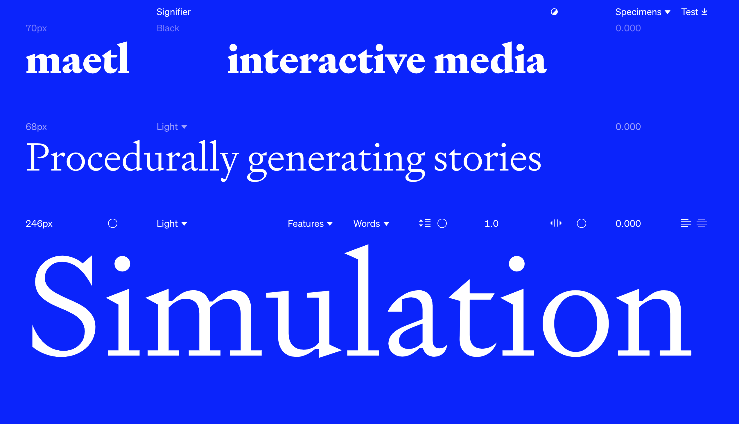
Signifier (Klim)
Centra (Sharp Type)
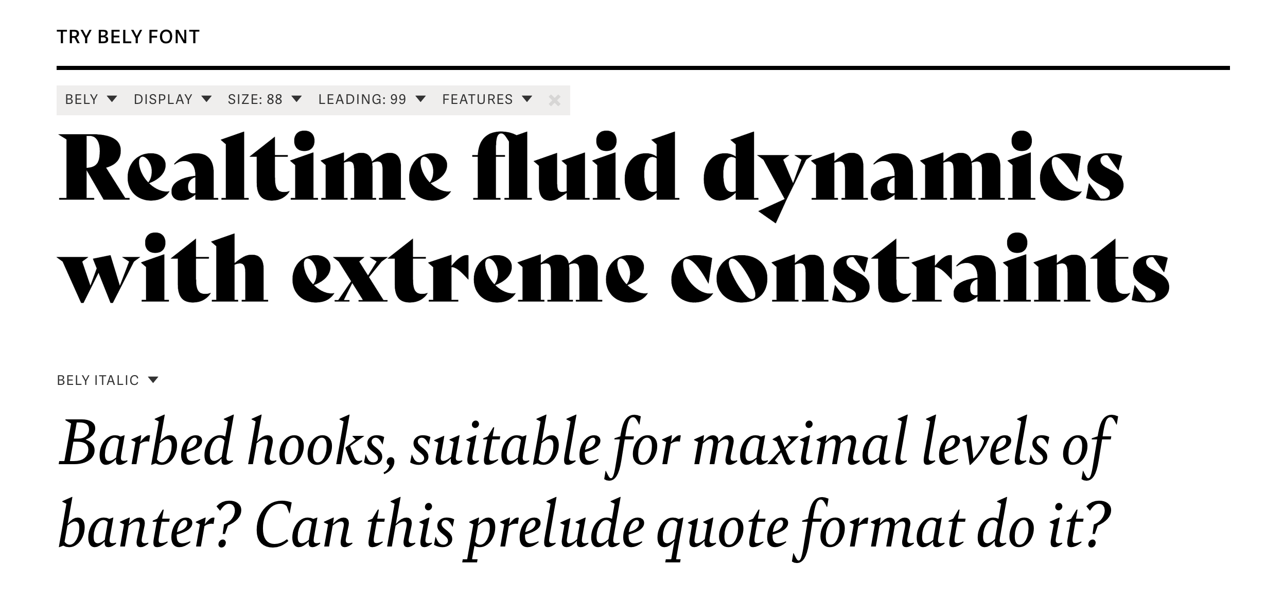
Bely (TypeTogether)
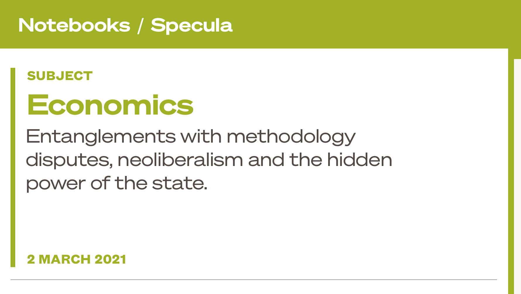
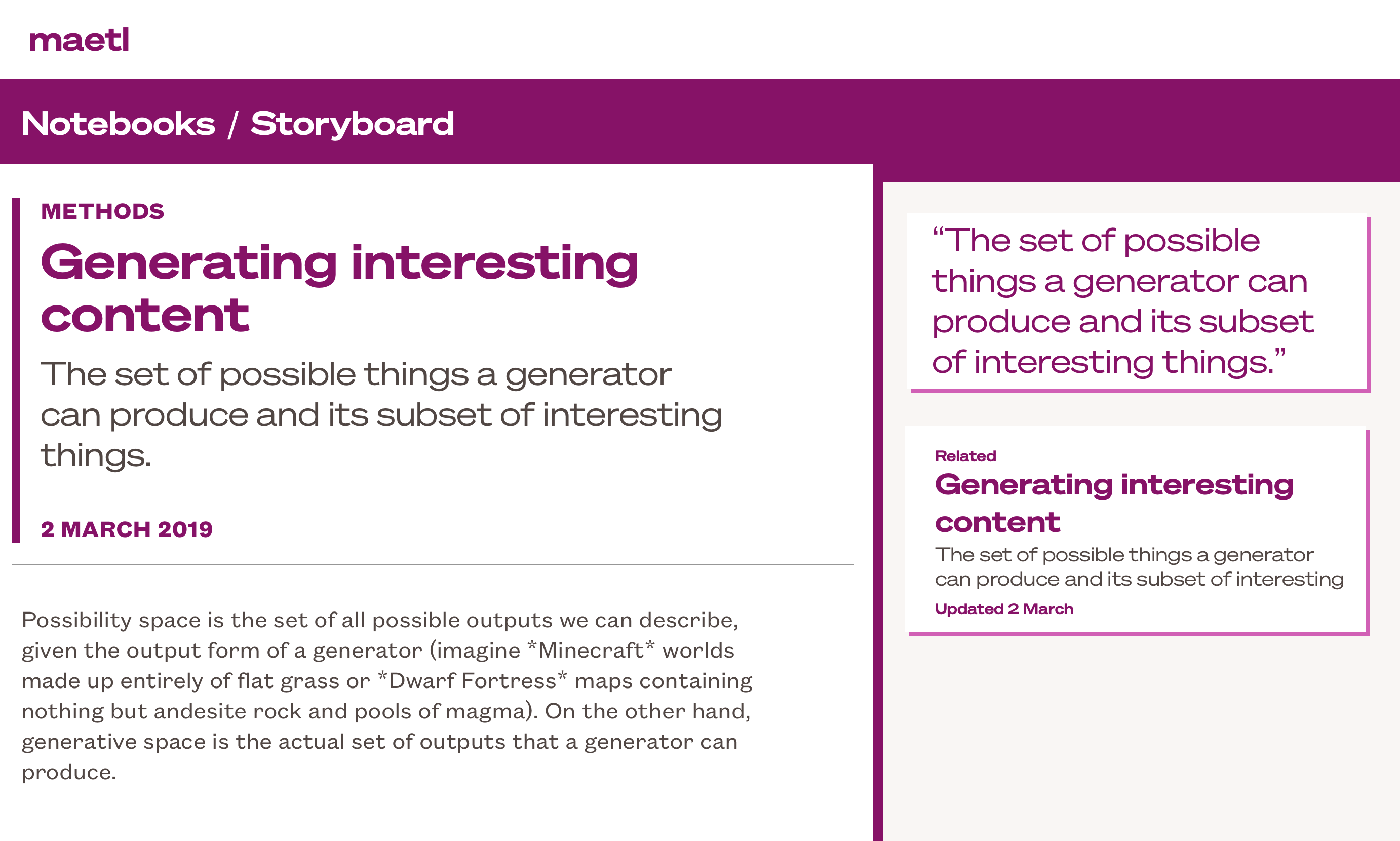
Notebook Header Experiments
Söhne and Söhne Breit
Signifier
Signifier and Söhne Breit
Signifier and Söhne Fett
Bely
Bely and Söhne Fett
Signifier and Bely
Process WIP
So I’ll park this for now and let it sit for a few days. When I come back to it I’ll figure out what decisions need to be made to transform this into something I can work with for the site.