Colour Palette
There’s no point in pretending like this was a straightforward or rational process and I didn’t bother to document most of the steps as I was doing it, but I’ll share a few elements of design and research that explain the purpose of the colour scheme and how it works.
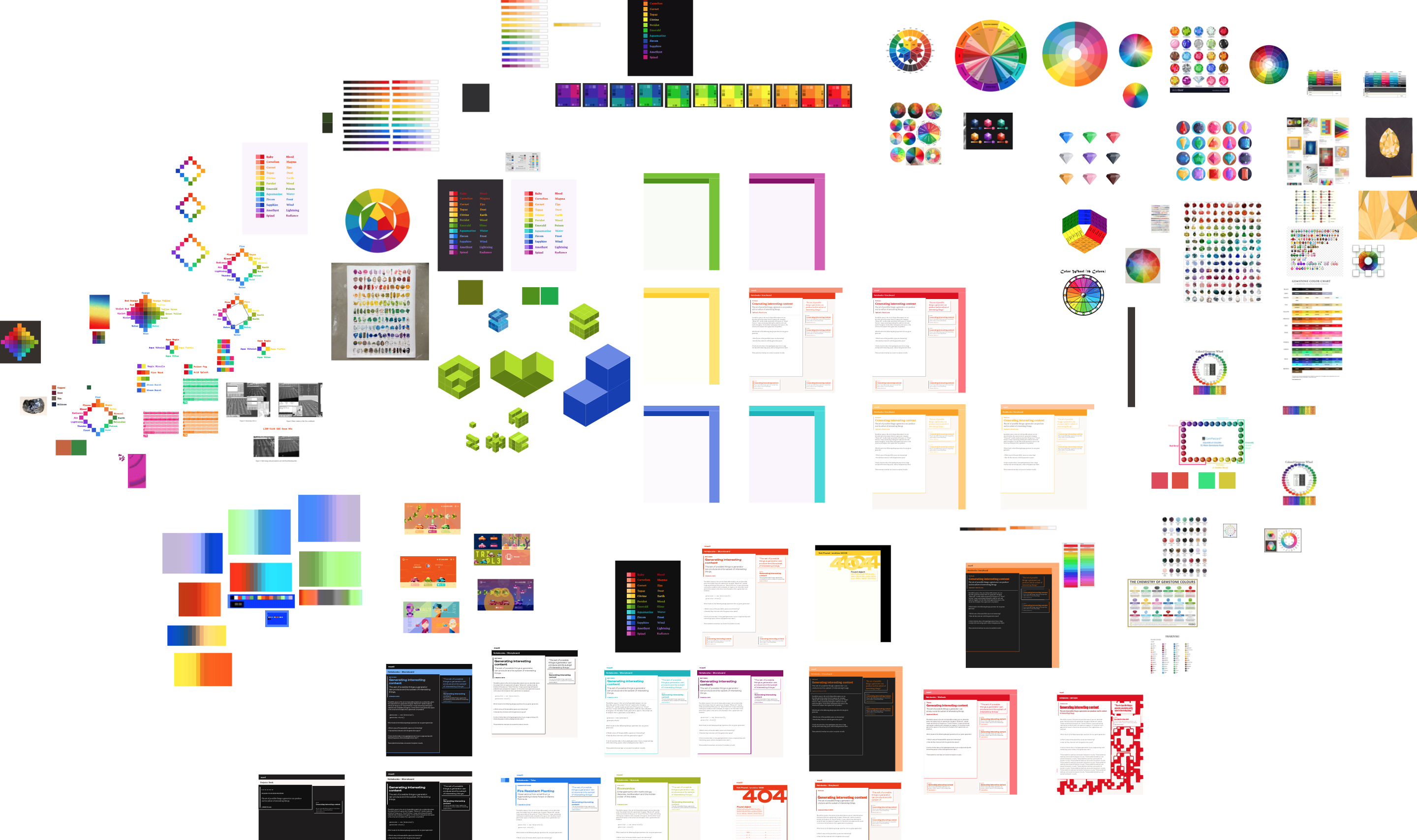
Early thinking and brief
I don’t remember when I first started thinking about this idea for a colour wheel palette but I really liked the idea of picking colours that were more honestly basic, normcore, premium mediocre, rather than feeling too moody and specific to the site.
I had ideas for weird generative art and interactive visuals that I wanted to embed which were better suited to a much more generalised and logical colour scheme than anything too crafted and specific. For that, I’d need a broad spectrum of high luminosity colours rather than a narrow hand-picked swatch.
Most colour palettes I’ve designed and worked heavily with over the years have been fairly restrictive within a particular brand identity or art aesthetic (as well as many run-ins with the infamous corporate collaboration trope of having 10+ different CSS colours on borders and buttons).
It was a fun challenge to think about doing something completely different, focused on data art aesthetics, psychedelic minimalism and brutalist web typography rather than delivering a consistent app experience. So much archived content and so litle time to pick out colours for every unique text, yet still wanting to express this variety.
One of the ongoing themes of this website is secret knowledge, underground metaverses, easter eggs, glitches in reality. The redesigned colour scheme should reinforce this aesthetically but also communicate this semantically. So it needs to be constructed in a systemic pattern, providing clues and legible tracer marks for more interested readers to uncover the hidden content.
Somehow I would have to capture all these ideas and requirements without straying too far from the site as found, so that style changes can be progressively updated in-place.
Cycling Colour Ramps
All kinds of colour ramps can be plotted on a cyclic colour wheel if care is taken to balance the differences in percieved lightness across step-changes between hues with an extra-spectral wraparound through purple and magenta providing the transition between blues and reds.
In digital design practice, colour ramps are most frequently applied in monochromatic swatches where it is straightforward to get good results with lightness varying evenly in steps (codified in tools like Sass with its lighten() and darken() functions).
When visualising data with quantitative and categorical dimensions we often want colour scales to shift in lightness for the quantitative dimension and shift in hue to display the categorical or qualitative dimension.
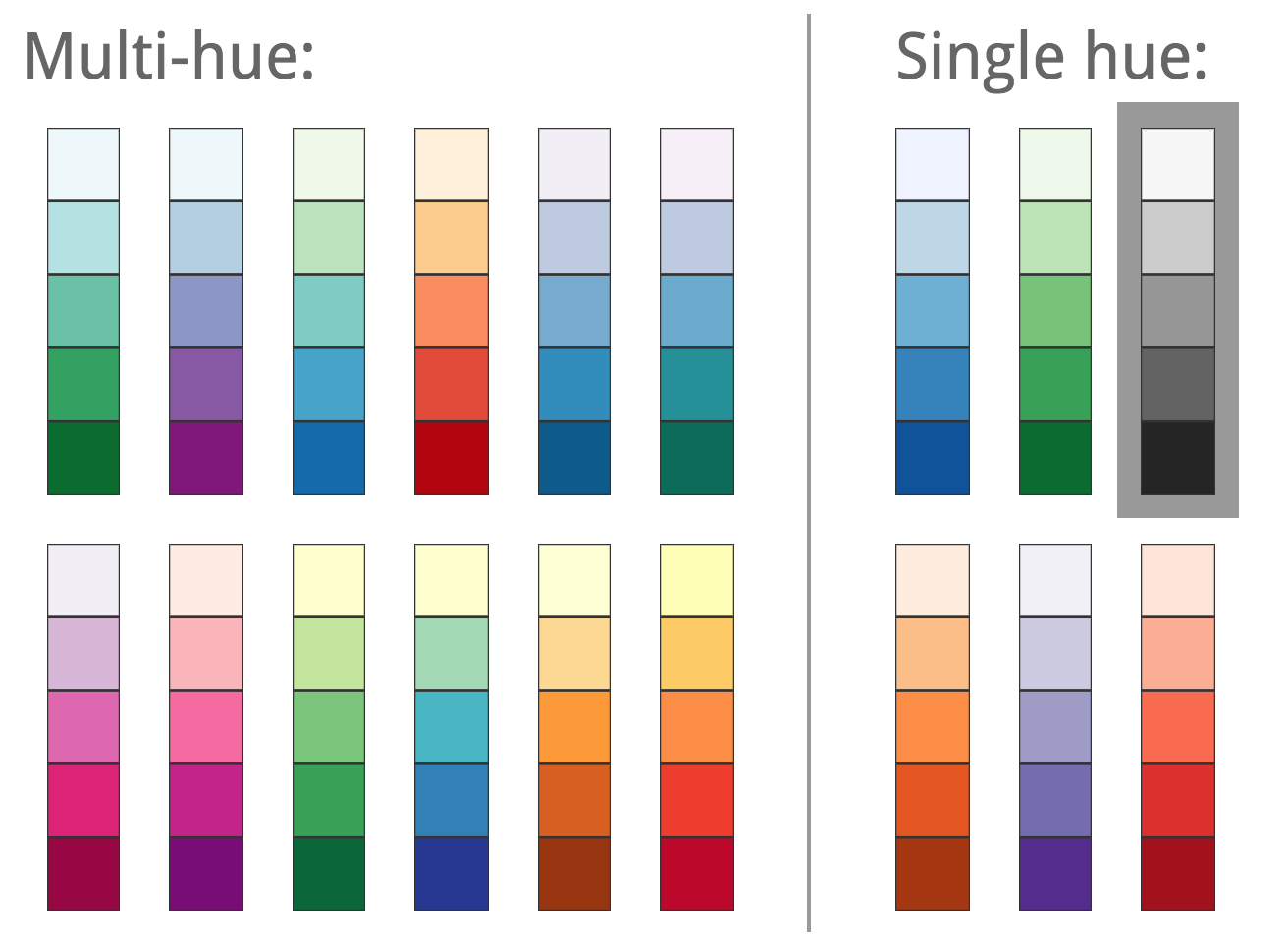
The highly regarded colour scheme by Cynthia Brewer was what first sparked my interest in these multi-hue colour scales which are more tricky to handle. Due to the variance in percieved lightness, particularly around yellow hues—for complex and weird reasons due to the overlapping spectral sensitivity of the L, M and S cones and ganglion neurons in the retina—designing aesthetically pleasing and technically robust systems of multi-stop hues requires more attention to detail than interpolating between equidistant lightness values.
In the 20th century, this problem was the impetus for the invention of perceptually uniform colour spaces like CIELAB where the given numerical distance between colours in the space closely matches the visible difference in these colours to a human viewer. CIELAB doesn’t do this perfectly but is widely considered to be ‘good enough’ for many uses in design.
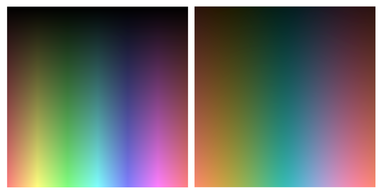
Even when we do convert from RGB or HSL into CIELAB, we can run into problems picking the middle colours when we get hard breaks in the lightness curve between equidistant colours.
Many colour visualisation tools use easing functions to interpolate between the start and end points of a colour ramp and correct lightness.
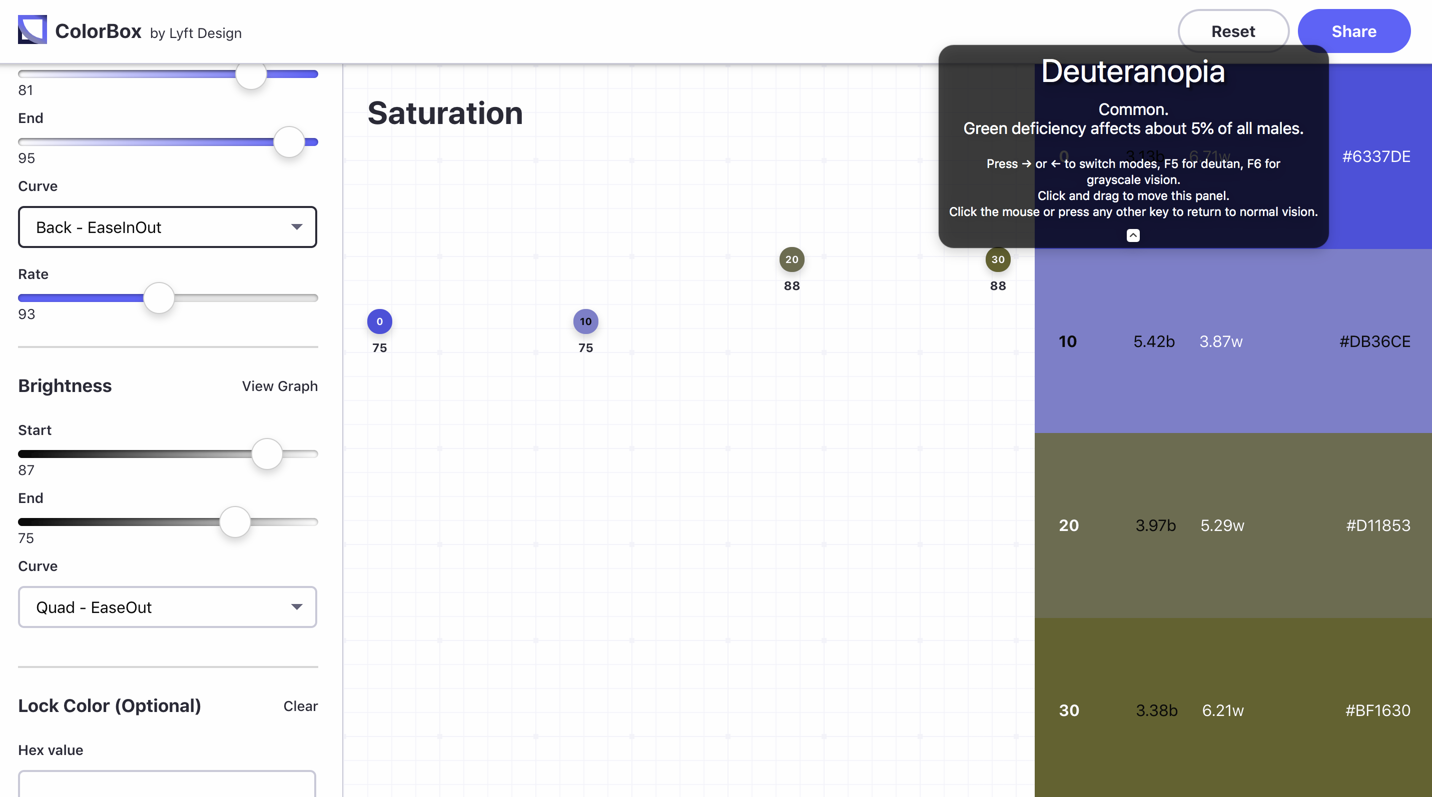
My favourite technique for doing this is to use Bézier curves. Instead of specifying the mid colour stops directly, we can specify reference colours as the control points of the curve and generate the mid gradient stops by interpolating the curve between these control point colours.
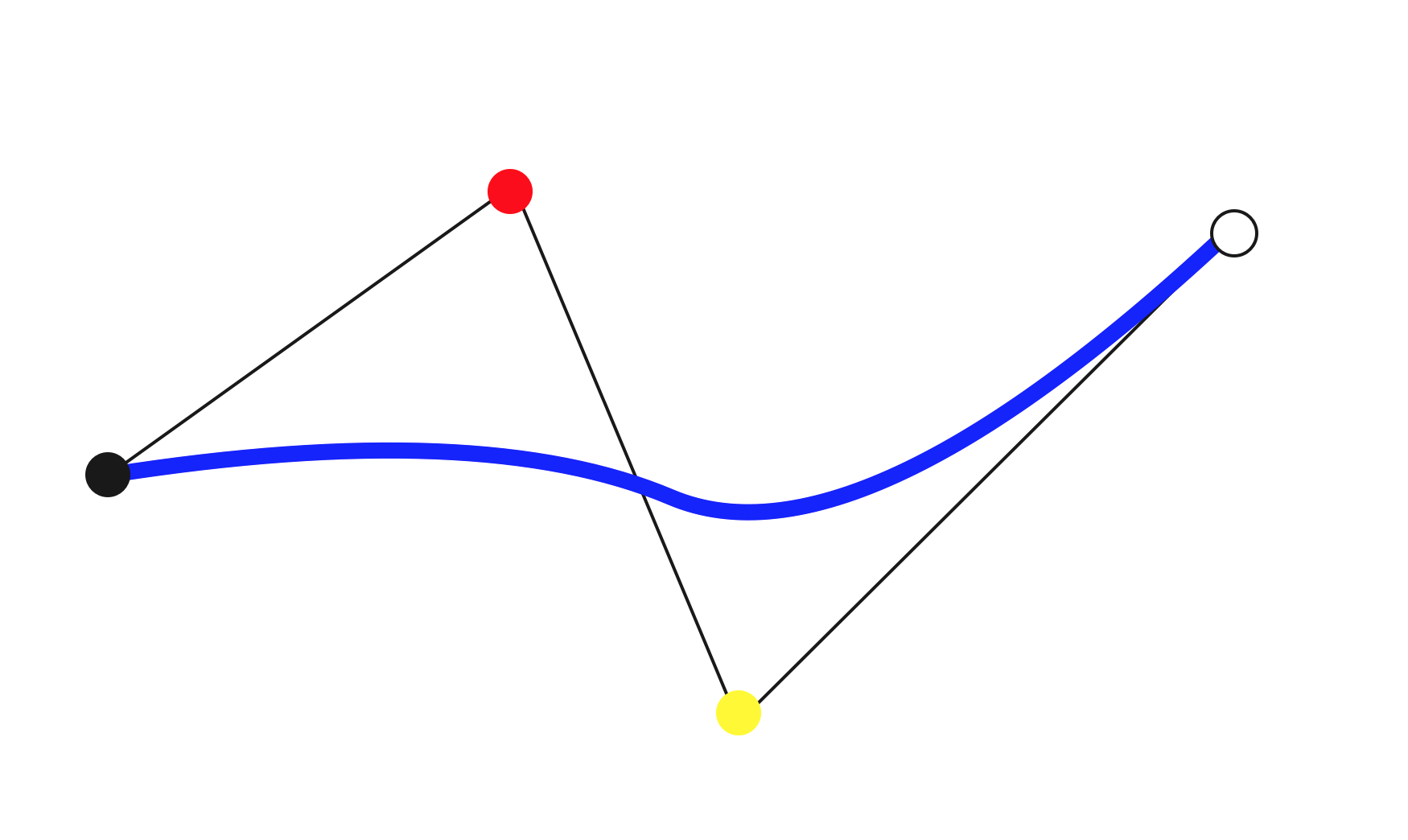
Chroma.js has a great implementation of this built in which provides fine-grained generative control over colour selection.
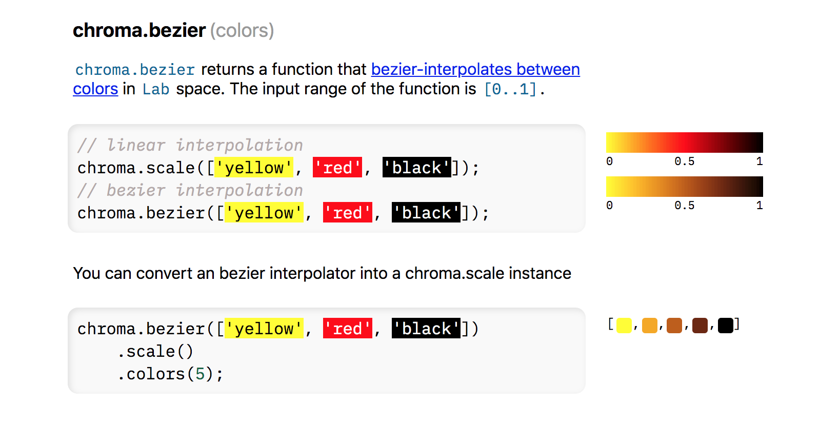
Chromatic Mining
A first attempt with 13 hues. This one ended up with a mapping to colour names but had too much distance between the stops and never quite felt right as a system.

As I explored, the constraints I wanted became more clear.


I bumped up the number of hues to 16 to make a more cohesive computable basis and played around with different configurations of opponent and complementary colours within the 16 segment ring until I got to an indexed palette that more or less met my vision.
Not perceptually uniform or lightness balanced. There are still major grid artifacts visible, but I’m coming round to the idea of actually showing these seams rather than trying to magic them away. I don’t really have the colour design tools I need to take this much further as-is anyway (and thinking about how to build the colour tools I really want is a whole other adventure).

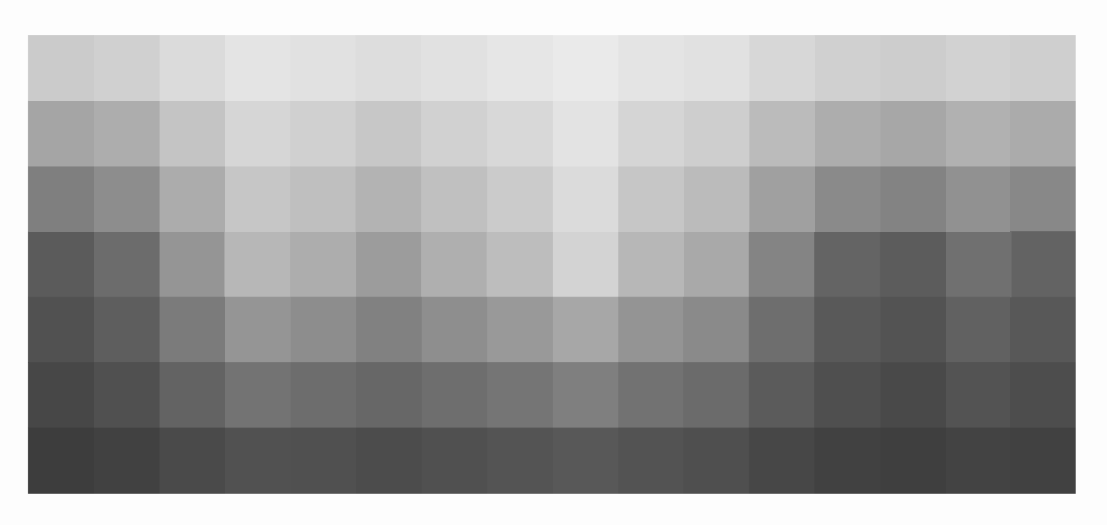
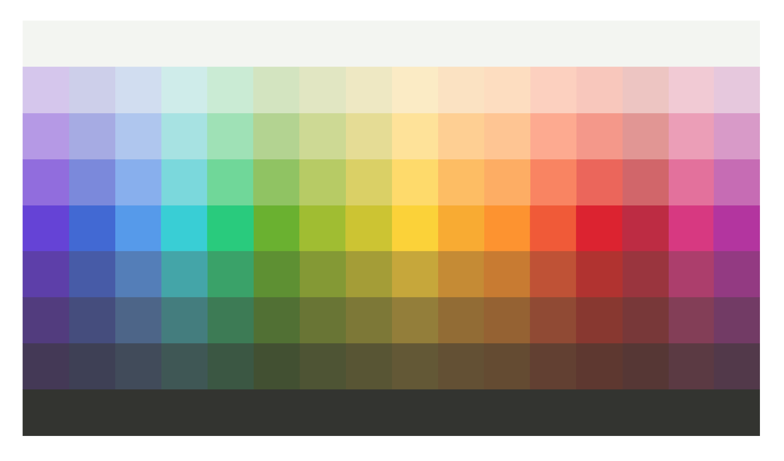
Good enough? We can put it to the test by using it to randomly generate colour swatches. It should hold up with a wide range of generative colour schemes and work well across large full-screen layout spreads.
Generating Colour Schemes
Colour schemes can be generated from the indexed palette using 2D stencil patterns in the wraparound grid space or by treating the index of hues as vertices in a cyclic graph and drawing symmetric relationships between them to generate opponent, split complementary, triadic and tetradic colour schemes.
First cut is to grab all the RGB stop values and set them up as a basic 2D grid.
const ChromaticColours = [
  "Indigo",
  "Navy",
  "Azure",
  "Cyan",
  "Zomp",
  "Lime",
  "Citron",
  "Sunflower",
  "Lemon",
  "Gold",
  "Flame",
  "Sienna",
  "Crimson",
  "Maroon",
  "Magenta",
  "Violet"
];

const ChromaticPalette = [
  ["#443857", "#523A80", "#5D3BAC", "#653BD9", "#9169E0", "#B597E7", "#D5C5ED"],
  ["#3E4056", "#454C7F", "#4659A9", "#4066D6", "#7A87DE", "#A6AAE5", "#CDCFEB"],
  ["#414B5B", "#4C6489", "#527DBA", "#5398ED", "#86AEEF", "#AEC5F0", "#D1DDF1"],
  ["#3E5755", "#427D7E", "#3FA5A9", "#2DCED6", "#77D8DD", "#A5E2E3", "#CEECEA"],
  ["#3A5742", "#3B7C54", "#34A367", "#16CC7A", "#6CD897", "#9DE2B5", "#C9ECD3"],
  ["#425131", "#507130", "#5D912C", "#68B322", "#8FC45D", "#B2D48E", "#D3E5BF"],
  ["#4E5432", "#697631", "#849A2C", "#9FBF1F", "#B7CC5E", "#CDDA90", "#E1E7C0"],
  ["#585532", "#7D7932", "#A49E2C", "#CCC61B", "#DAD15E", "#E5DD91", "#EEE9C1"],
  ["#635834", "#947F34", "#C7A82E", "#FCD31C", "#FFDB62", "#FFE394", "#FBECC3"],
  ["#635032", "#936D30", "#C68C2A", "#FAAC1B", "#FEBE5C", "#FFD08F", "#FCE2C0"],
  ["#654B30", "#96622E", "#CA7B28", "#FF9419", "#FFAE5D", "#FFC68F", "#FEDDBE"],
  ["#634031", "#914A31", "#C15230", "#F2592E", "#FB845D", "#FFAA8D", "#FDD0BE"],
  ["#5F382F", "#89382D", "#B3322B", "#DE1F29", "#ED6557", "#F69888", "#F9C7BB"],
  ["#573734", "#793838", "#9C343C", "#BF2A40", "#D36568", "#E39693", "#EEC5C1"],
  ["#5C3A43", "#843D57", "#AE3C6C", "#D93481", "#E56F9C", "#ED9DB7", "#F2CAD4"],
  ["#53384A", "#733A66", "#943783", "#B52FA1", "#C869B5", "#D999C9", "#E7C7DD"]
];
I don’t really care what the names are at this stage, maybe it’s something I will come back to and refine, maybe not.
See the Pen Maetl Colour Palette by Mark (@maetl-the-encoder) on CodePen.
Now I’ve got it in indexed form, I can test a few different generative approaches.
First up, let’s tinker around playing Fairy chess with variations of analogous colour schemes as well as encode the more obvious integer relationships that represent complementary and tetradic colour schemes on the 16 stop colour wheel.
I haven’t quite figured out the best way to model this in code yet, but the basic approach is to set up stencils that define neighbourhoods of grid cells.
const ColourRamp = [
  "Dark",
  "DarkMid",
  "MidDark",
  "Mid",
  "MidLight",
  "LightMid",
  "Light"
];

const ColourStops = 16;

const MonochromeStencil = {
  shift: [0, 0, 0, 0],
  ramp: [-3, 3, 1, 0]
}

const AnalogousStencil = {
  shift: [0, 2, 1, 0],
  ramp: [-3, 0, 0, 0]
}

const SplitComplementaryStencil = {
  shift: [0, 0, 7, -7],
  ramp: [-3, 0, 0, 0]
}

const OpponentStencil = {
  shift: [0, 0, 8, 8],
  ramp: [-3, 0, 0, -3]
}

const TetradicStencil = {
  shift: [4, 8, 12, 16],
  ramp: [0, 0, 0, 0]
}
See the Pen Maetl Generative Swatches by Mark (@maetl-the-encoder) on CodePen.
It works! Enough for the purposes here of opening up some of the combinatorial possibilities of the palette. There’s additional work remaining to fine tune the lightness and variation across the 2D grid. Correct it by hand? Some sort of constraint satisfaction pass over each colour with reference to its neighbours? Does it need to go any further? I’m fine with this for now as a first draft.
Colour Grammar
Do the hues and ramps need names? This is often a point of discussion and contention on design systems teams. It would be convenient if colours could be accessed with direct array reference and nothing else but that would make the position of colours in the middle hard to remember.
The best decision around this always depends on who the audience is. I’m writing for me, so it doesn’t really matter. Ridiculous, I know, but there’s now enough material to create a procedurally-generated magic system using these colours. (I did say there was hidden content to discover, hint, hint.)
| Index | Unique descriptions | Transition metals | Gemstones | Spell attacks |
|---|---|---|---|---|
| 0 | Indigo | Titanium | Tanzanite | Thunder |
| 1 | Navy | Cobalt | Sapphire | Frost |
| 2 | Azure | Aluminium | Topaz | Water |
| 3 | Cyan | Vanadium | Aquamarine | Acid |
| 4 | Zomp | Chromium | Turquoise | Poison |
| 5 | Lime | Zinc | Emerald | Wood |
| 6 | Citron | Scandium | Peridot | Earth |
| 7 | Sunflower | Nickel | Apatite | Mineral |
| 8 | Lemon | Sulphur | Citrine | Metal |
| 9 | Gold | Palladium | Chalcedony | Magma |
| 10 | Flame | Copper | Sunstone | Fire |
| 11 | Sienna | Cadmium | Carnelian | Plasma |
| 12 | Crimson | Iron | Garnet | Blood |
| 13 | Maroon | Ruthenium | Ruby | Radiance |
| 14 | Magenta | Manganese | Spinel | Air |
| 15 | Violet | Zirconium | Amythest | Lightning |
Final step from here is to generate Sass variables and CSS custom properties from the base colour palette. This is the main use for the colour names.
The fastest way to do it is to write a quick generator in NodeJS that loops through the 2D grid to spit out lines. I’ll run it as a command line script and pipe the stdout to a new Sass file.
let colourLines = [];

for (let hue=0; hue < ColourStops; hue++) {
  let hueName = ChromaticColours[hue].toLowerCase();
  for (let ramp=0; ramp < ColourRamp.length; ramp++) {
    let colorValue = ChromaticPalette[hue][ramp];
    colourLines.push(`$color-${hueName}-${ramp}: ${colorValue};`);
  }
}

console.log(colourLines.join("\n"));
And there we go. I now have the full set of colour values accessible through both JavaScript and Sass/CSS.
Again, I wish I had better colour design tools that corresponded directly to the steps in my process and enabled me to automate all this more effectively.
I still don’t feel like the unique descriptions match up as cohesively as I would like, but I’m not going mess with it unless the names start to annoy me when I’m working with them. At this point, I’ve done enough on colour and can start to put the design system into practice on the site while I work through the next steps of making typography and layout decisions.