Archive Templates
It’s time to deal with the debris of archived CSS and editorial design. I’m not entirely sure yet if this will require more thinking around content modelling and archiving as an explicit publishing step. The main problem I’m looking to solve is being able to leave archived stuff in place indefinitely without having to do any extra work in future, should I want to redesign again or change more recent parts of the site.
The main part of the solution I came up with involves taking static snapshots of essays and transcripts, including not just the HTML content but also frontend assets. Handling the JavaScript was mostly a matter of testing the generated output pages to ensure they worked in browser. Handling the CSS is a bit more compliated as it involves making design decisions.
Wayback When
In hindsight, I should have handled this at the time I published anything on the site with distinct typography and layout design. The only reason I need to do any of this reconstruction is because I didn’t isolate and capture static snapshots as part of the original publishing process. Lesson learned.
A complicating factor here is that I can’t just replace all the HTML and CSS with copypasta from archive.org as I’m almost certain I will have fixed typos, spelling mistakes and made minor edits to essays and transcripts months or years after they were published. Snapshots from the Wayback machine will be reliable in terms of CSS and HTML structure but not in terms of text content. Something to watch out for.
There’s only one text article that crosses three of the CSS eras—2010, 2014, and 2018—so that’s a good starting point for digging around in the Wayback Machine:
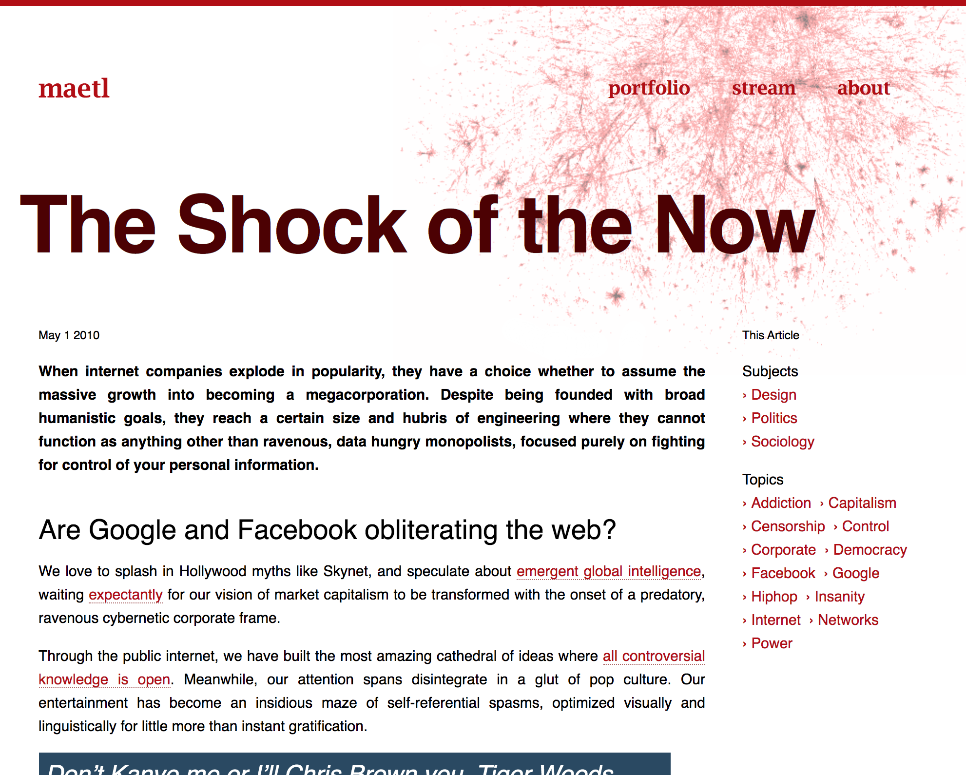
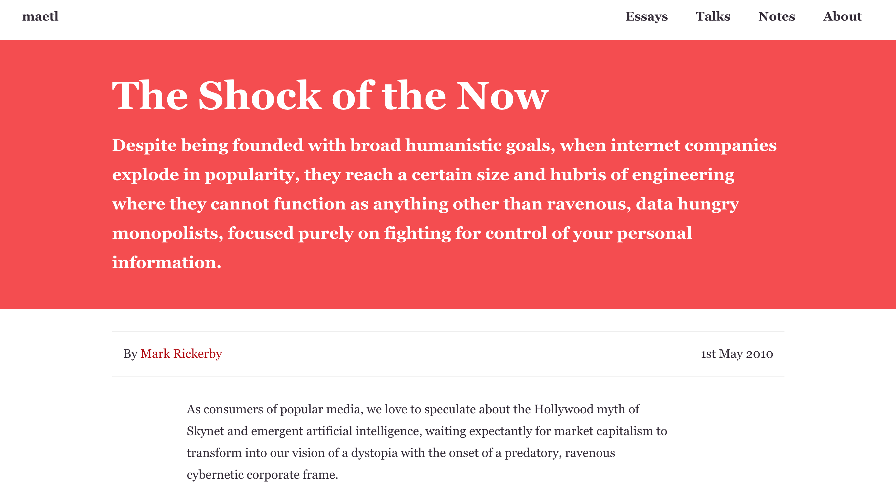
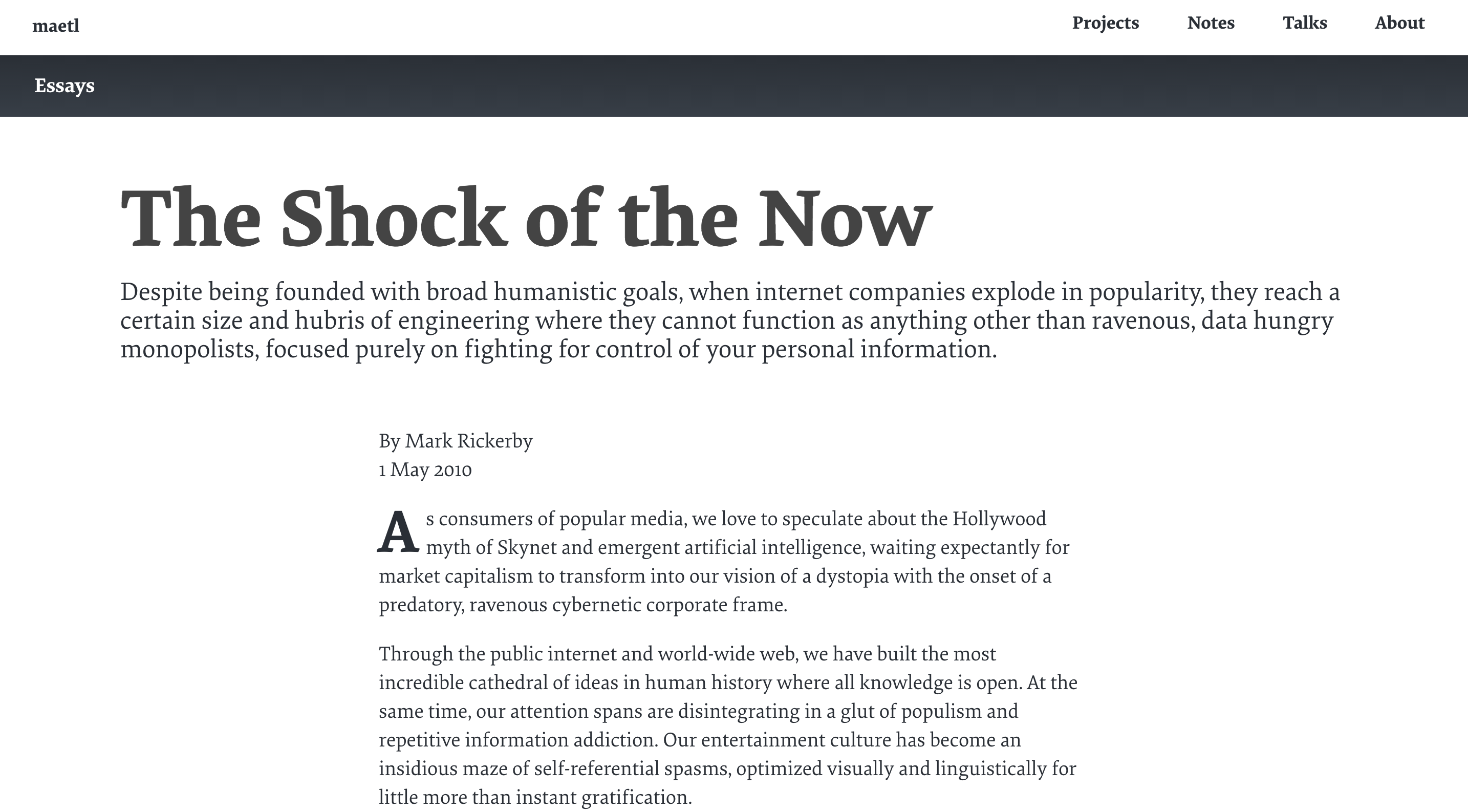
Comparing the different presentations strongly reinforces my sense that the archive templates should be styled to reflect how each article was originally presented on the site. Web fonts from 2010 and 2014 are missing so these snapshots aren’t 100% accurate, but they give a good sense of how the template structure changed between different versions of the site.
Transitional layout
The layout to support this has to allow legacy HTML to be dumped into the template so it can expand to 100vw without any wrapping containers or style inheritance from shared nav and other new CSS components.
+---------------------------------------+
| Header (site style)                   |
| Breadcrumbs & archived content notice |
+---------------------------------------+
|                                       |
|            Archive snapshot           |
|             (theme style)             |
|                                       |
+---------------------------------------+
| Footer (site style)                   |
+---------------------------------------+
It’s possible I could create some kind of archive wrapper box style for the legacy content to go into but I can leave this until I come to look at the new site typography and layout as a whole.
The two main goals for this transitional layout are to frame the context of the article in the new style (noting that this is old archived content from the before times that probably contains mistakes and things I no longer agree with) and that it gets out of the way and lets the snapshotted content do its own thing with the full viewport width.
The topic of archived content notices hasn’t recieved much discussion and thought in the web design space. The Guardian is one of the few publications who has done an exceptional job of managing this and their justification and explanation for their recent design change is worth a read.
For a personal website, the challenge is a bit different as it’s a question of how much to reveal about past mistakes, new knowledge, changes of opinion and bitrotten thoughts that are difficult to comprehend after Trump and COVID. One of the main reasons I want to preserve this archive is to help me to reflect on my own journey. Although there were many things I didn’t adequately know or understand, my predictions of Facebook’s destructive political path since 2010 were broadly accurate and correct (and years ahead of many people in the media and academia). As a senior worker in the tech industry at the time with zero public relations and lobbying influence, my opportunities to warn people were limited, but I still wish I had gone further and regret not doing more. It is what it is, and this is my record of that.
Bouncing off old stylesheets
2010 is findable as everything from the original essay was snapshotted in a single file on archive.org our-kitchen-sink.css (I wish I still knew where that name came from but there is no real explanation for it. All I know is that it’s got strong Berlin 2010 vibes.)
It’s filled with screen-specific magic numbers that seem related to the popular resolutions of laptops at the time and the font metrics of Museo Sans (not Museo Slab, which was the main font on the rest of the site in 2010). Helvetica is next in the font stack, which gives it a more classic web brutalist look from that previous decade. I also notice that the paragraph text is justified—something I almost never do, so I must have been going for a particular effect. How much of this is worth preserving, I’m not yet sure.
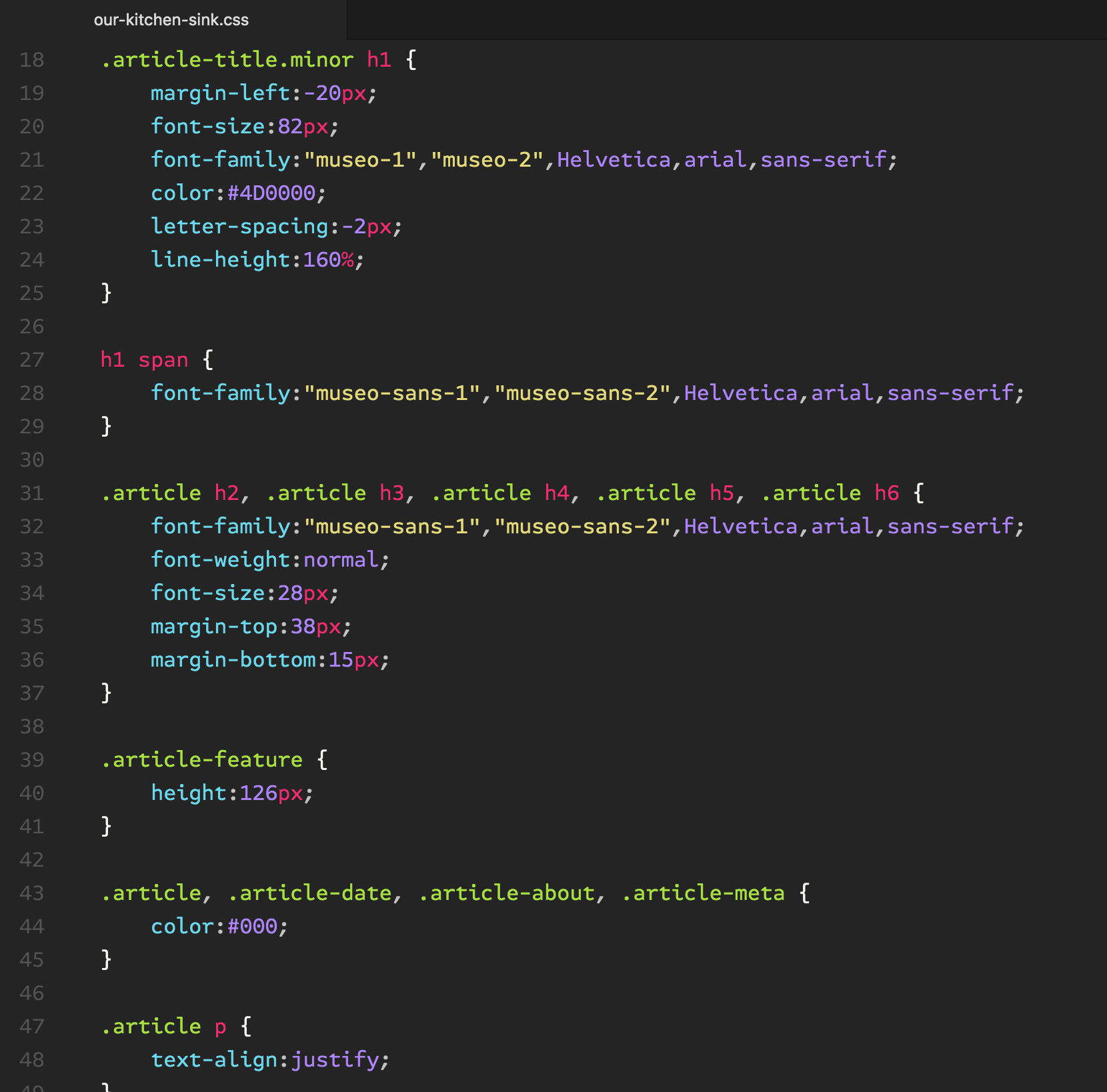
Another thing that’s funny to notice here is the old TypeKit convention of splitting glyphs for a single font across multiple @font-face declarations. Was this for licensing obfuscation purposes or a performance hack to get browsers to download larger webfonts in parallel? I can’t remember.
Sketching out a new direction
Perhaps there’s another way of looking at this. Instead of trying to reproduce different legacy looks, what if I could get more impressionistic. Is there a way to tie these different archive eras together visually, keeping the theming styles simple and modular, and ensuring visual continuity across large typographic and colour variations?
If I can achieve this, I think I would much prefer it to my original thinking of grabbing snapshots of legacy layouts and dumping them online indefinitely. With the chaotic legacy CSS, there’s a lot of redundancy and broken bits that don’t work at all on mobile devices (which is probably why I got rid of the original styling in the first place).
One of the common elements of the old themes is a fixed background image aligned to the top right. This could be a starting point for messing around with ideas.
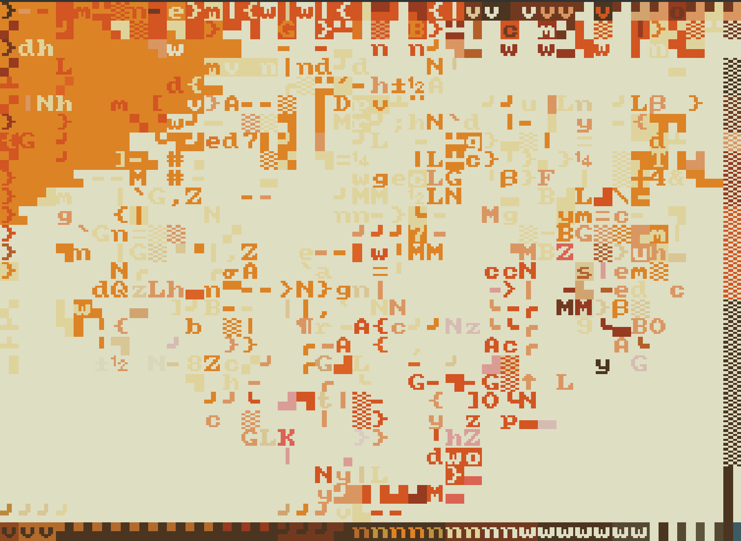
My initial thoughts are around grabbing these images with the original colour scheme and bitcrushing them in some way to give off more of a decayed, faded, ancient appearance. There’s a few different ways I immediately think of to do this—diffusion dither, blend mode effects and so forth, but there’s another direction I can go: downsampling pixels into glyph blocks.
This direction is appealing because I can open Playscii and start messing around importing and converting raster images rather than having to write or wrangle any digital art algorithm stuff (fun, but also a lot more intricate and time consuming than what I had budgeted for this work).
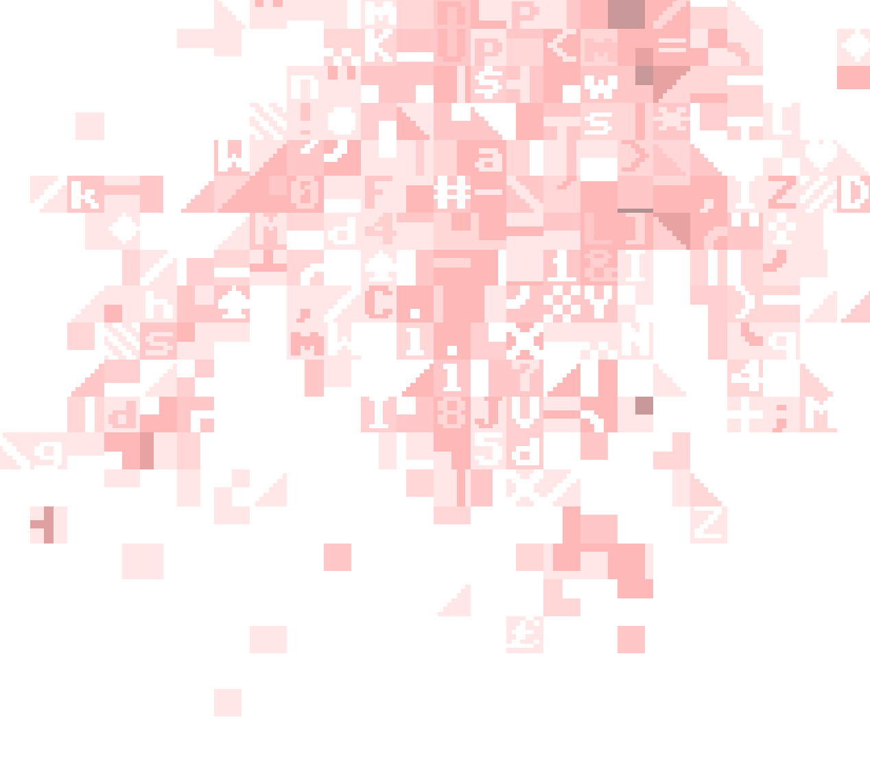
This is definitely starting to feel like the direction I want for the archive. I can retain the original colour palettes with these deconstructed backgrounds indicating the age of the content and reinforcing that it’s fixed in place, separate to the rest of the site which is still evolving.
A mini styleguide for the archive
Going down this path will require a mini styleguide—or at least some basic decisions and principles to be written down—to avoid exacerbating the messy accumulation and inconsistencies. And even though the emphasis here is on quickly putting together a rough draft that is ‘good enough’, I don’t want to do anything that restricts or blocks the possibility of replacing or extending this with generative methods in future.
The easiest way for me to improvise something to support these goals without spending too much time on it is to make a list of the core graphic design elements that are always present but could vary between different archive pages and sections. These are not mutually exclusive and there are some dependencies. They’re simply elements that could be changed independently of the other elements:
- Modular scale and layout grid
- Headline/cover typography treatment
- Body typography treatment (including paragraphs, blockquotes, figures)
- Colour palette
- Background art
This might seem a little pedantic or overly rationalised. The reason I do it is to get a clear idea of what I’ve got to play with in terms of emphasis. If everything changes between each instance of a layout, it will become a visual riot with no clear anchor points for readers to understand the relationship between things. If everything remains the same with no variations, the shared structure overwhelms the expression of individual pieces of writing.
The initial sketching leads towards the following framework:
| Element | Template scope | Variations |
|---|---|---|
| Scale & grid | Sitewide | Modular so individual pages can pick units for placement and size |
| Headline/cover | Essays, talks | 1–3 different styles depending on presence of kicker or lede paragraph and cover image |
| Body typography | Essays, talks, entries | Talk transcripts use legacy snapshot styles, essays and entries use shared text styles |
| Colour palette | Essays, talks, entries | Fixed for each essay and collection of entries based on original colours |
| Background art | Essays, talks, entries | Fixed for each essay and collection of entries based on original colours |
So core typography features, size and scale relationships, and placement of content into the layout will remain consistent across all (with perhaps a small set of template variations or adjustments to match the specific needs of different articles). One idea I’m still kicking around but haven’t decided on is setting a smaller body font size for archive pages than the rest of the site to create a clear distinction between fresh writing and stuff that’s old and gathering dust.
The background art style should reinforce the feeling of ‘gathering dust’, like viewing the previous versions of the site through tinted glasses that crush and quantize the original bitmaps into chunky blocks. There’s only one or two things that need to be locked in at the styleguide level for this: character set and layout placement.
After sketching out a few variations of this, I’m fairly certain the best choice is some variation of the PETSCII character set. The C64 was my first computer and the pseudographics glyphs—horizontal and vertical lines, hatches, shades, triangles, circles and card suits—had a huge influence on me as a kid. The diagonals and triangles in particular imbue generated images with a distinct retro aesthetic that translates well into different colour palettes and sizes. If I do decide to spend more time on this in future, everything I do here should leave the possibility open for translating variations of the original bitmap glyphs into SVG paths that could be used to build a procedural grammar for fluid layout backgrounds.
Layout placement and use of background art is easy for anything before 2010 or so, but it’s not obvious how to handle things that are currently 5–10 years old. Not ancient and corroded but still archived and mired in the thinking of the beforetimes and perhaps not to be trusted.
One visual concept could be to introduce the retro character blocks in a subtle and gradual way for more recent content, expanding to full page background explosions on the really ancient content. Along with the text size variation, these two elements could do the bulk of the work in communicating how old and out of date a piece of writing is.
I kinda like this if it means less work on figuring out how to write and display an archived content notice. I still think this is going to be helpful but I would prefer a more subtle date-driven notice (similar to what The Guardian has done) rather than a longer, more personalised missive about why this writing is still on the site and what it means to be. (Oh god, I am eventually going to end up doing this though, aren’t I?)
Let’s build this
Building this is where the payoff from all the freeform sketching and styleguide planning comes in. There’s enough design/art direction here that I don’t need to spend any additional time sketching out layouts and typography. I can build each archive layout quickly as a manual chore, pulling in new elements as needed and following the predefined decisions around variations and structure.
Though I still don’t have the modular scale and grid or typography defined for the whole site, I can let everything hang off of the current defaults, and get to the more precise details later.
The main template logic changes needed are to support the archive notice and to inject some sort of breakdown of the archive stylesheet era/aesthetic.
The archive notice is a block that can be switched on and off depending on the presence of an archive property on the Essay and Transcript content types.
{{#archive}}
<header class="archive-message">
  <b>Archive</b>
  <p>This writing is from the beforetimes and does not reflect current thinking</p>
</header>
{{/archive}}
To switch this on and start testing, I can put a new archive: true field into the frontmatter or add a proxied accessor method to the Essay and Transcript classes (this would usually be done in Ruby static site generators via an attr_reader or some sort of in-memory model supporting value objects and entity types).
Here, I’m using dry-struct and dry-types:
class Essay < Types::Struct
  # etc...
  #
  attribute :archive, Types::Bool.meta(omittable: true)
end
Figuring out how to inject style controls and manage the content templates and CSS rules is a bit more tricky. I don’t want to overthink it, so I go back through the our-kitchen-sink.css file and pull out specific bits of repeatable styling, mostly for blockquotes. I learn that yet another typeface—Bree—was in use on this page at the time which is about the most cliché 2010 design thing I can imagine, and reinforces how extremely different the style of this piece was to anything else I’ve done.
Rather than overthinking this, a more modern theming approach does not need to worry about distinguishing between unique page specific layouts and shared layouts. Instead, what we want to do is inject a set of design tokens into the DOM when the page loads and leave it to clever CSS definitions and the power of the browser runtime to apply all the style variations needed across different parts of the site.
The main thing that needs to change to support this is the Essay content type, which now needs an Archive type to hang these new properties off.
class Archive < Types::Struct
	attribute :design_tokens, Types::Hash.meta(omittable: true)
end

class Essay < Types::Struct
  # etc...
  #
  attribute :archive, Archive
end
This supports adding a custom set of design tokens to the front matter of any item that is included in the archive:
archive:
design_tokens:
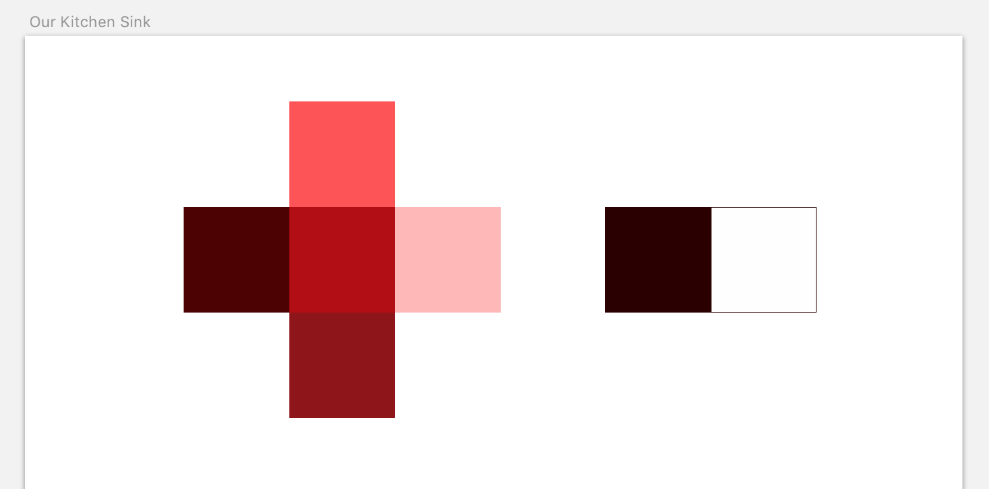
color_spot_dark: "#4D0001"
color_spot_mid: "#B30909"
color_spot_light: "#FFB8B7"
color_primary_dark: "#2C0000"
color_primary_light: "#FEFEFE"
The design tokens can be any CSS custom property/value pairs. It’s not a great idea to go too far designing an exacting theme schema at this stage since I have no clue what this would actually look like yet, and want to make a first attempt extracting token ideas from the legacy layout snapshots.
Implementing this in the template could vary greatly depending on programming language, content model, and template engine. Here, we’re using Mustache so the shortest path to getting this working is to add a read-only accessor to the Archive content type that generates a structure to iterate over in the template:
class Archive < Types::Struct
	attribute :design_tokens, Types::Hash.meta(omittable: true)

	def design_tokens_as_props
		design_tokens.keys.map do |prop|
			{ property: prop.to_s.gsub("_", "-"), value: design_tokens[prop] }
		end
	end
end
The thing to watch out for here is transforming the YAML- and Ruby-friendly underscore separators to the CSS-friendly dash separator.
The design tokens can be injected into the DOM using an inline style rule:
{{#archive}}
:root {
  {{#design_tokens_as_props}}
    --{{property}}: {{value}};
  {{/design_tokens_as_props}}
}
{{/archive}}
This is now in a place where I can get to work on the design and typography and start locking archive layouts into place.